Which Logo Do You Like The Best?

Which Logo Do You Like The Best?


  • Total voters
    18

edgarf76

Affiliate Guard Dog Member
Joined
Oct 10, 2013
Messages
1,128
Reaction score
250
Whats going on guys and gals. I have some logos for review, and want some opinions. There are seven in total, which logo do you like the best?
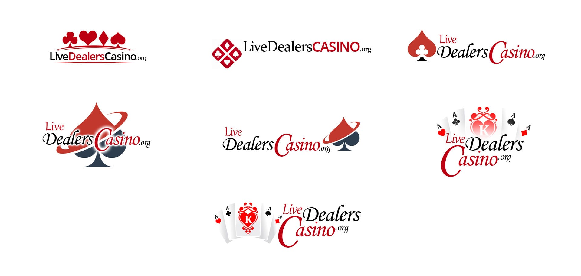
livedealerscasino_logo_mockups.jpg
 

Suzie

Affiliate Guard Dog Member
Joined
Jul 15, 2019
Messages
7
Reaction score
3
I like logos number 2 and number 5. They are clean and easy for me to see the brand name.
 

LandofOz

Affiliate Guard Dog Member
Joined
Mar 25, 2009
Messages
710
Reaction score
280
I love number 6. Who made them for you? They're brilliant !!
 

NDG

Affiliate Guard Dog Member
Joined
Sep 19, 2013
Messages
654
Reaction score
461
I picked 7.. but I'd probably go with 6 or 7. I like how the words are not aligned.
I'm not a fan of 1 or 2 because I don't really like all of the words squeezed together.

Just my personal preference. It would also depend on the design of the web site template.
Some look better with stacked words.. and other with the words spread out in a line.
 

BetOnlineUK

Affiliate Guard Dog Member
Joined
Jun 8, 2016
Messages
431
Reaction score
202
I like 6 but I would be tempted to have the C of Casino the same size as the rest of the word. Or at least sitting on the baseline of the word.
 

petjah

Affiliate Guard Dog Member
Joined
May 29, 2014
Messages
38
Reaction score
20
Number 1 is clean, simple and the only practical one. I checked your website and you have a horizontal logo inline with the menu. All the other logo's are too wide or too high.

You could easily delete the card symbols for a more minimalistic version. The rest is too busy and looks imo very amateur
 

baldidiot

Affiliate Guard Dog Member
Joined
Feb 23, 2011
Messages
708
Reaction score
215
For me it depends a little on the site theme and layout. Do you have a mock up?
 

edgarf76

Affiliate Guard Dog Member
Joined
Oct 10, 2013
Messages
1,128
Reaction score
250
For me it depends a little on the site theme and layout. Do you have a mock up?

These are all supposed to be mockups. I am just not sure which one fits the site best. #2 is so clear and the url is displayed on one line. However, I really 5,6 and 7.
 

baldidiot

Affiliate Guard Dog Member
Joined
Feb 23, 2011
Messages
708
Reaction score
215
These are all supposed to be mockups. I am just not sure which one fits the site best. #2 is so clear and the url is displayed on one line. However, I really 5,6 and 7.

Oh I meant a mock up of the site it's going on. Ie: putting the logo in the context of the site.
 
Top