
- Joined
- Dec 13, 2006
- Messages
- 11,228
- Reaction score
- 3,144
The forums are now set to the current style so that others don't have the issues Viktar and Perc had. Thanks to Perc for determining what happened!

WOW -Thanks for the troubleshooting!!!! You are a savior! I'll get the developer to force everyone to 'Use Forum Default'
")
Andy,
It is not all about how the forum looks, it is all about if one can read and discuss important issues and find information.
IMO it looks very busy and a lot of colors and also very "wide". I think you need to go for smaller not bigger, look at the GPWA its lean and mean.
You need to ask yourself the latest posts on top etc does it really add more info ?
For the sponsors you can add a << horizontal scroll bar >>
payment calander - recent term alerts - your services ----- should be your main 3 columns
user profiles etc under quick links.
Just an idea.
I like the new look, the header is way cool.
For some reason this thread is not showing up in the "recent forum posts" area in the header and not showing up on the New Posts tab.
Will look into it.
I don't like to critisize... much!* Wider Forums - The forums will now be without a sidebar. This means that our forums will now be wider and easier to read.
Could be some setting on your PC - mine looks fine!Like the new look ;D
But I do have one gripe.. The "New Posts" and "Today's Posts" on the left hand side is kind of annoying as it follows my scrolling cutting off words and getting in the way of things.
Is there a way to stop it? I cant seem to find it.
Cheers
Matt
Like the new look ;D
But I do have one gripe.. The "New Posts" and "Today's Posts" on the left hand side is kind of annoying as it follows my scrolling cutting off words and getting in the way of things.
I don't like to critisize... much!
But making it wider does not make it easier to read IMHO.
OK, maybe it is for those using the "old squarish screens" - but both my laptops are wide-screen and so each line is now very long.
It's OK if people space out their text nicely - but if it's "a big block of text" I might struggle.
Just a minor point I know - but I personally preferred it with the side-bar.
I fully support the idea of asking members to use AGD links to support the site.
I have already joined a couple of affy programs that way - so that might earn you about 4 pennies over the next 5 years...
I will also look at the casinos to see if there is any slight chance that you list some I haven't already joined...
Mind you, you wouldn't earn much off me that way either unless they have regular DECENT bonuses...
KK
That's about what I make from sub-affiliate revenue already, so you will double my earnings!! Woohoo!!!! Thanks KK!I take that back!Could be some setting on your PC - mine looks fine!
( Windows 7 & ie8 )
Well I did screenshot it - but of course I can't post it in the normal way because I literally can not upload any more images!And... please try to insert an image so you can screenshot the error message. I'll have my developers make you an image god.

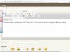
Well I did screenshot it - but of course I can't post it in the normal way because I literally can not upload any more images!
So I had to host the image on one of my own sites:
The Red box shows my quota all used up.
The Green box is a display error you might like to fix at some point.
KK
Displays fine for me.
Like the layout, hate the default to "quick reply" and boy - is everyone here color blind? Don't like those overpowering, garish colors one bit!
Other than that I like it....
Now I don't see any limit at all - and I just uploaded a big screenshot OK (then delete it).Tell me what you see now.....
Now I don't see any limit at all - and I just uploaded a big screenshot OK (then delete it).
Thanks for fixing that! :emoticon-0137-clapp
KK